
Plotting in 2D#
The Heatmap Object#
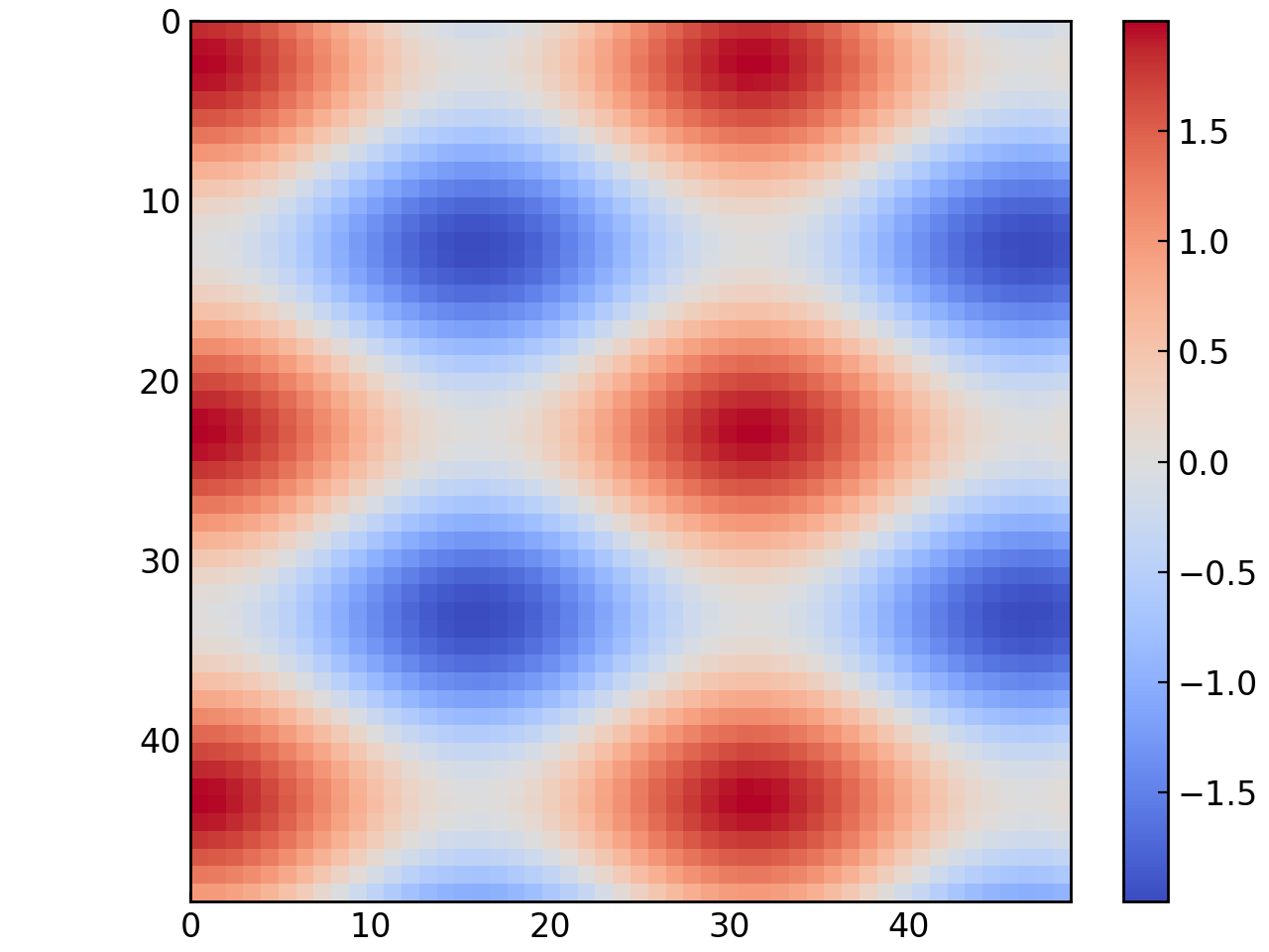
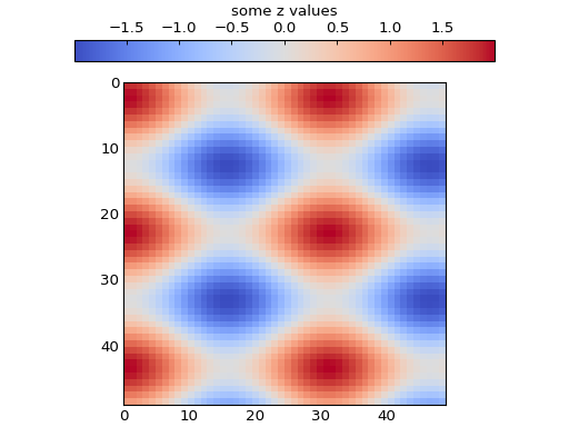
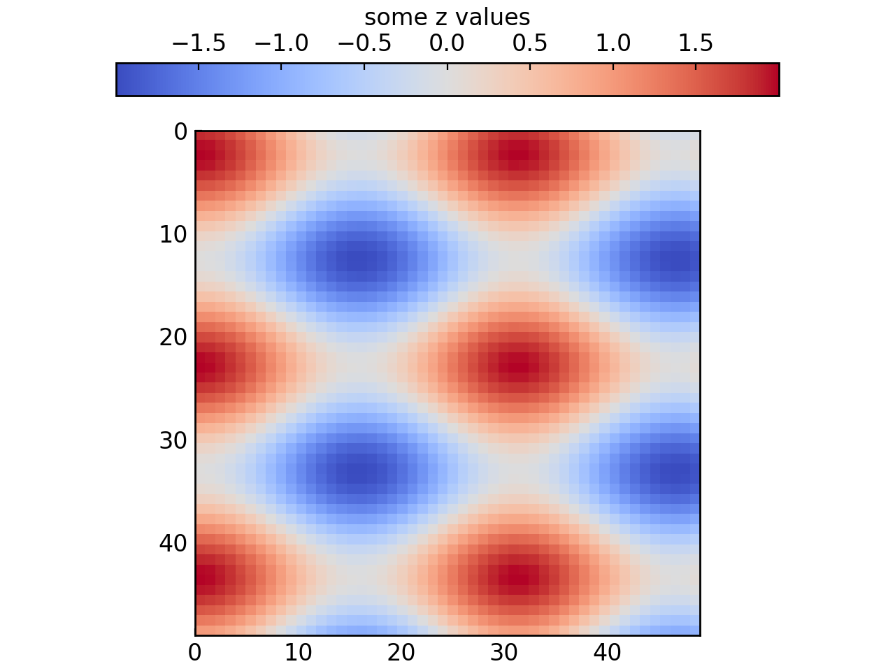
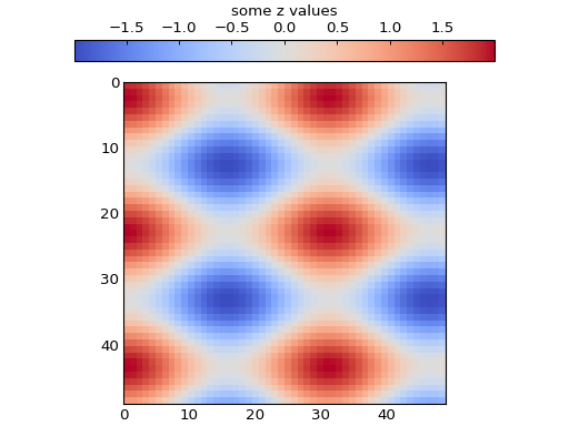
The Heatmap class allows you to plot a 2-dimensional map of values or display images inside a set of axes. Here is how you can create a Heatmap:
x_grid, y_grid = np.meshgrid(np.arange(0, 50, 1), np.arange(0, 50, 1))
data = np.cos(x_grid * 0.2) + np.sin(y_grid * 0.3)

map = gl.Heatmap(data)
figure = gl.Figure()
figure.add_elements(map)
figure.show()
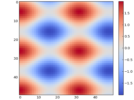
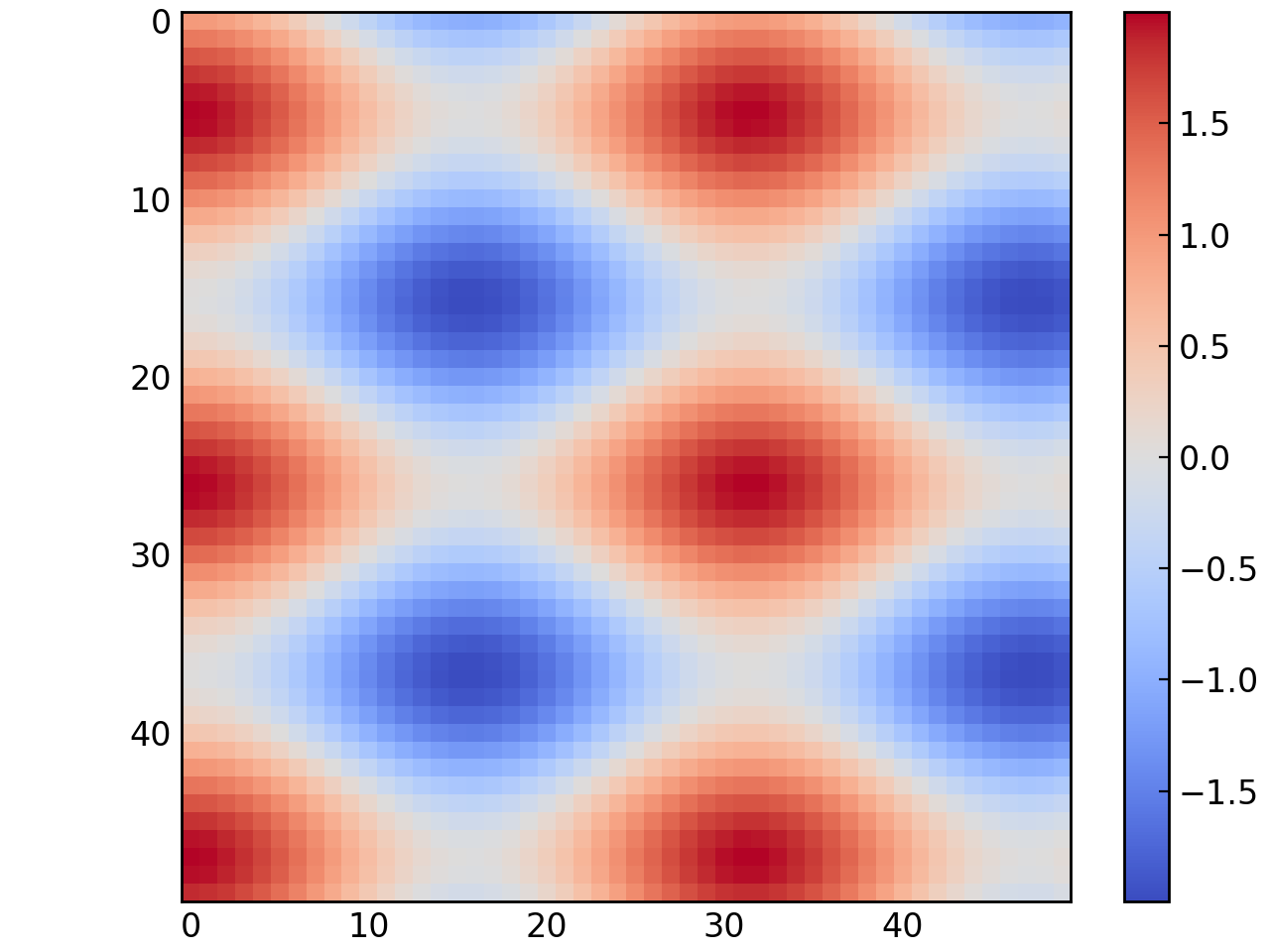
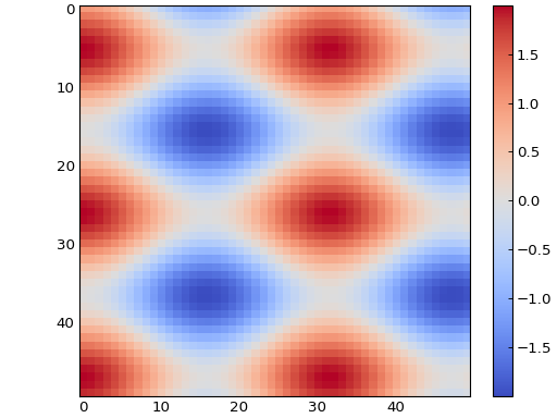
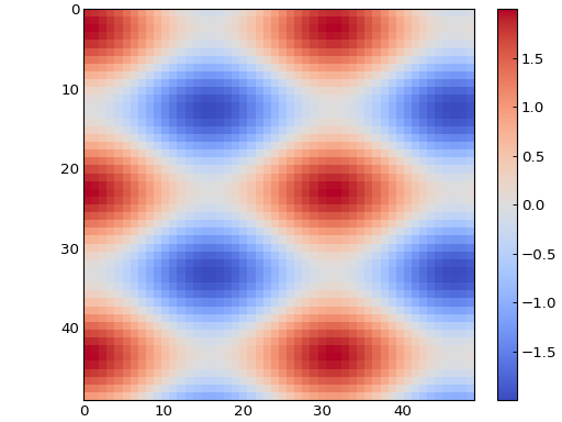
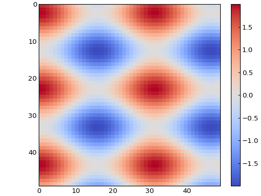
As for the Curve and Scatter objects, it is possible to create a Heatmap from a function with the from_function() method:
map = gl.Heatmap.from_function(
    lambda x, y: np.cos(x * 0.2) + np.sin(y * 0.3), (0, 49), (49, 0)
)

figure = gl.Figure()
figure.add_elements(map)
figure.show()
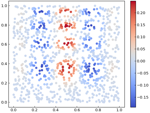
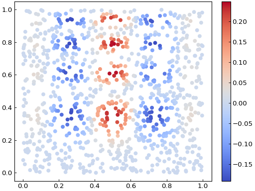
It is also possible to create a Heatmap from a list or array of values at unevenly distributed points. Take for example the data displayed below:
def func(x, y):
    return x * (1 - x) * np.cos(4 * np.pi * x) * np.sin(4 * np.pi * y**2) ** 2

generator = np.random.default_rng(seed=0)
points = generator.random((1000, 2))
values = func(points[:, 0], points[:, 1])

scatter = gl.Scatter(
    x_data=points[:, 0],
    y_data=points[:, 1],
    face_color=values,
    color_map="coolwarm",
    show_color_bar=True,
)

fig = gl.Figure()
fig.add_elements(scatter)
fig.show()
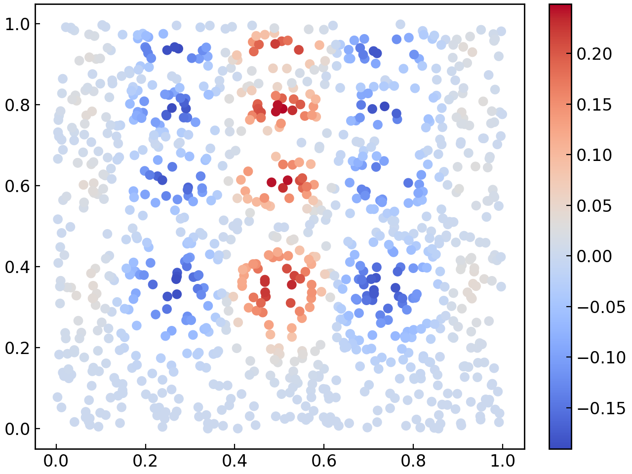
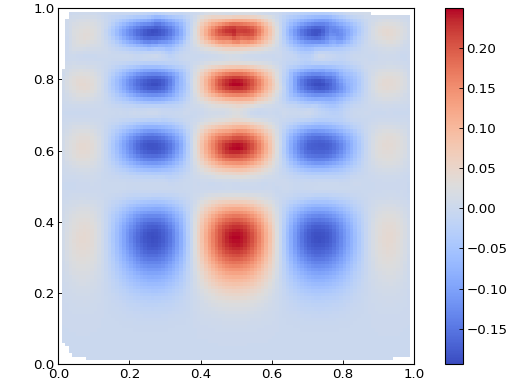
The from_points() method used below will interpolate the data on a grid and create a Heatmap from this interpolated data:
def func(x, y):
    return x * (1 - x) * np.cos(4 * np.pi * x) * np.sin(4 * np.pi * y**2) ** 2

rng = np.random.default_rng(seed=0)
points = rng.random((1000, 2))
values = func(points[:, 0], points[:, 1])

fig = gl.Figure()
hm = gl.Heatmap.from_points(
    points,
    values,
    (0, 1),
    (0, 1),
    grid_interpolation="cubic",
    number_of_points=(100, 100),
    origin_position="lower",
    color_map="coolwarm",
)
fig.add_elements(hm)
fig.show()
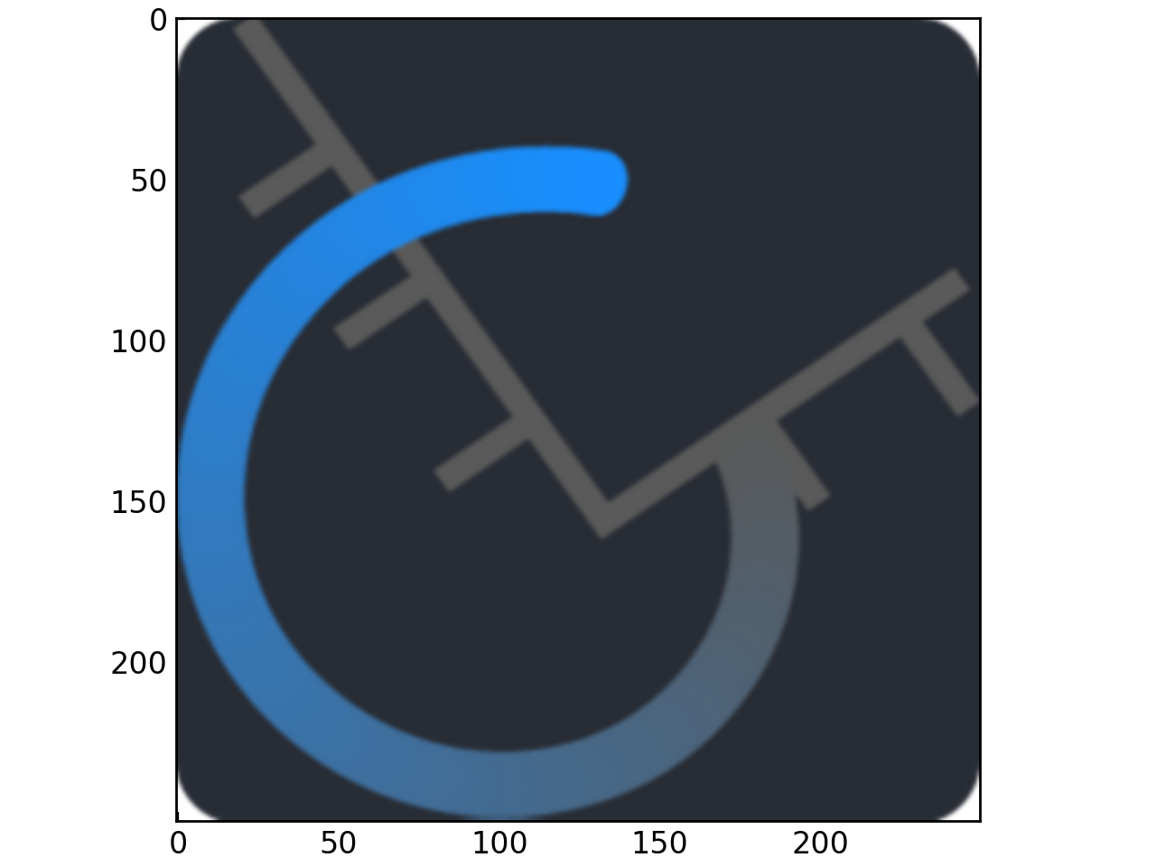
To display an image instead, simply create a Heatmap with the path to an image as a string instead of actual data:
map = gl.Heatmap("../_static/icons/GraphingLib-favicon_250x250.png")
figure = gl.Figure()
figure.add_elements(map)
figure.show()
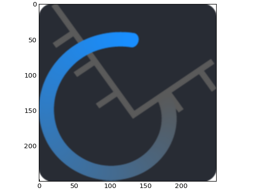
There are again many parameters to control for the Heatmap objects but an important one to mention here is the interpolation parameter. This allows you to choose an interpolation method to apply to the Heatmap data (image or not). The possible values for this parameter are the interpolation methods for imshow from Matplotlib. Using the bicubic interpolation on the GraphingLib logo before:
map = gl.Heatmap("../_static/icons/GraphingLib-favicon_250x250.png", interpolation="bicubic")
figure = gl.Figure()
figure.add_elements(map)
figure.show()
Note
By default, there is no interpolation applied to the data.
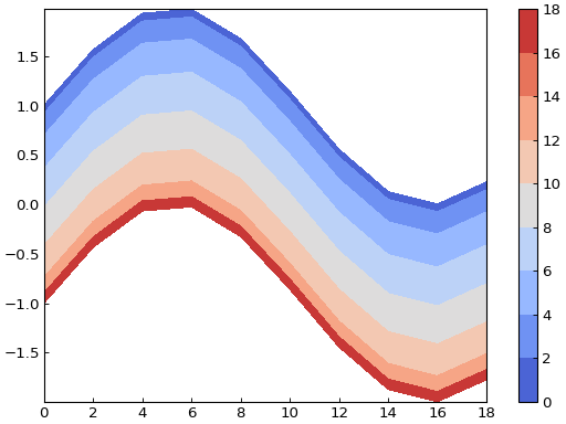
It is also possible to create a Heatmap from a page of a PDF file using the from_pdf() method. This requires the optional graphinglib[pdf] extra (install with pip install graphinglib[pdf]):
map = gl.Heatmap.from_pdf("images/sample_flowchart.pdf")
figure = gl.Figure()
figure.add_elements(map)
figure.show()
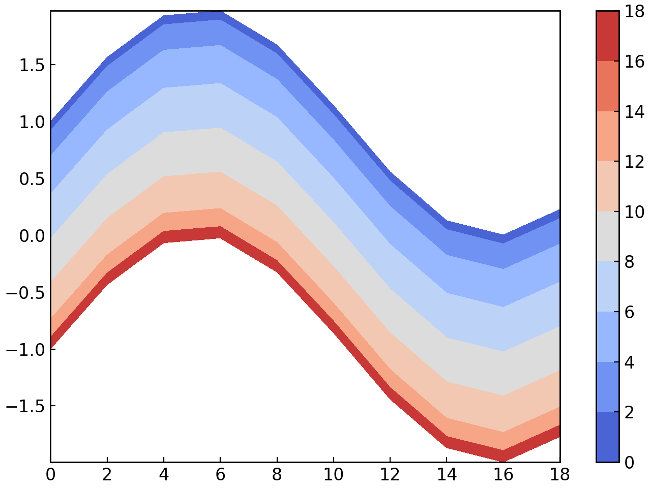
By default, the page is kept as an RGB image, the same way a plain image path is displayed. Passing grayscale=True instead converts the page to scalar intensity data, so that color_map (which defaults to "gray" in that case) is applied to it like any other Heatmap:
map = gl.Heatmap.from_pdf("images/sample_flowchart.pdf", grayscale=True, color_map="viridis")
figure = gl.Figure()
figure.add_elements(map)
figure.show()
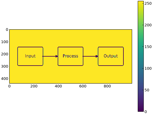
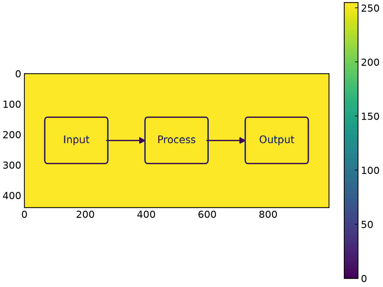
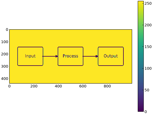
The from_pdf() method also accepts page (to pick a page in a multi-page PDF) and dpi (to control the resolution used to rasterize the page).
The Contour Object#
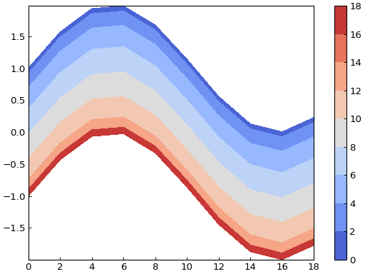
The Contour class allows you to display a contour plot of 2-dimensional data. Here is an example of how to create a Contour object from the same data used in the Heatmap examples:
x_grid, y_grid = np.meshgrid(np.arange(0, 20, 2), np.arange(0, 20, 2))
data = np.cos(x_grid * 0.2) + np.sin(y_grid * 0.3)

contour = gl.Contour(x_grid, y_grid, data)
figure = gl.Figure()
figure.add_elements(contour)
figure.show()
The contour class also has a from_function() method:
x_grid, y_grid = np.meshgrid(np.arange(0, 20, 2), np.arange(0, 20, 2))
contour = gl.Contour.from_function(
    lambda x, y: np.cos(x * 0.2) + np.sin(y * 0.3), x_grid, y_grid
)
Configuring the colorbar#
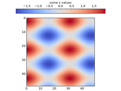
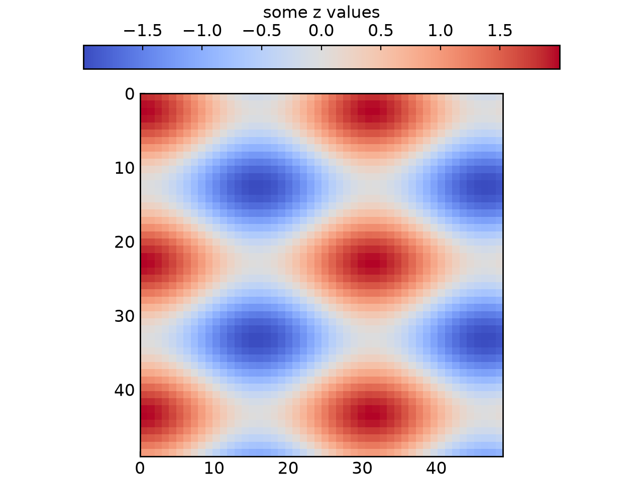
The colorbar options can be customized through the set_color_bar_params method of both Heatmap and Contour objects. The label and position of the colorbar can be set using this method, as well as any other arguments normally passed to the plt.colorbar call. Here is an example of setting parameters for the colorbar:
map = gl.Heatmap.from_function(
    lambda x, y: np.cos(x * 0.2) + np.sin(y * 0.3), (0, 49), (49, 0)
)
map.set_color_bar_params(label="some z values", position="top", shrink=0.75)

figure = gl.Figure()
figure.add_elements(map)
figure.show()
The VectorField Object#
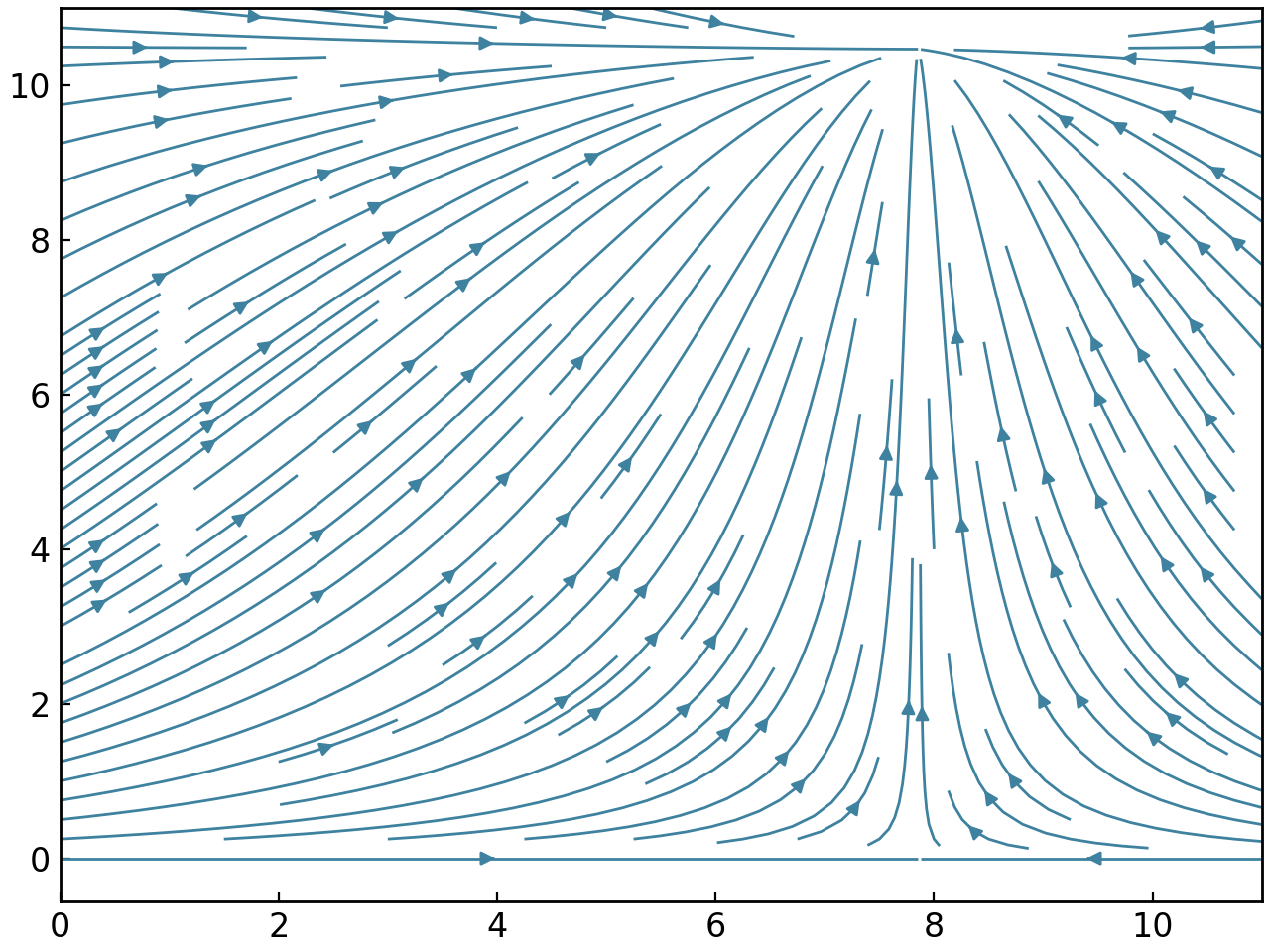
As its name suggests, the VectorField class allows you to plot a 2-dimensional vector field. Here is an example of its usage:
x_grid, y_grid = np.meshgrid(np.arange(0, 11, 1), np.arange(0, 11, 1))
u, v = (np.cos(x_grid * 0.2), np.sin(y_grid * 0.3))

vector = gl.VectorField(x_grid, y_grid, u, v)
figure = gl.Figure()
figure.add_elements(vector)
figure.show()
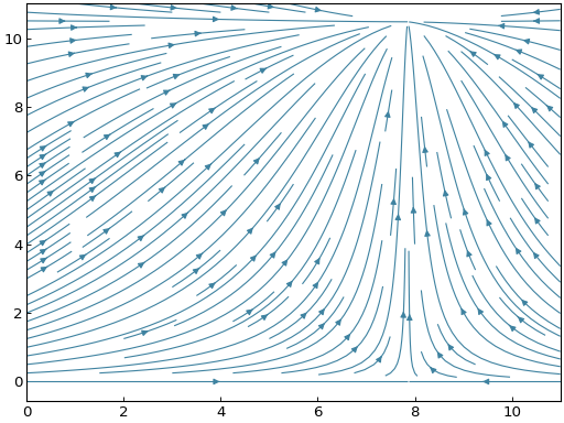
As both classes discussed prior, the VectorField object has a from_function() method:
vector = gl.VectorField.from_function(
    lambda x, y: (np.cos(x * 0.2), np.sin(y * 0.3)), (0, 11), (0, 11)
)
The Stream Object#
The Stream class allows you to create stream plots in GraphingLib. Here is an example of its usage:
x_grid, y_grid = np.meshgrid(np.linspace(0, 11, 30), np.linspace(0, 11, 30))
u, v = (np.cos(x_grid * 0.2), np.sin(y_grid * 0.3))

stream = gl.Stream(x_grid, y_grid, u, v, density=1.5)
figure = gl.Figure()
figure.add_elements(stream)
figure.show()
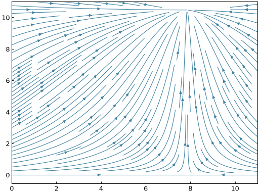
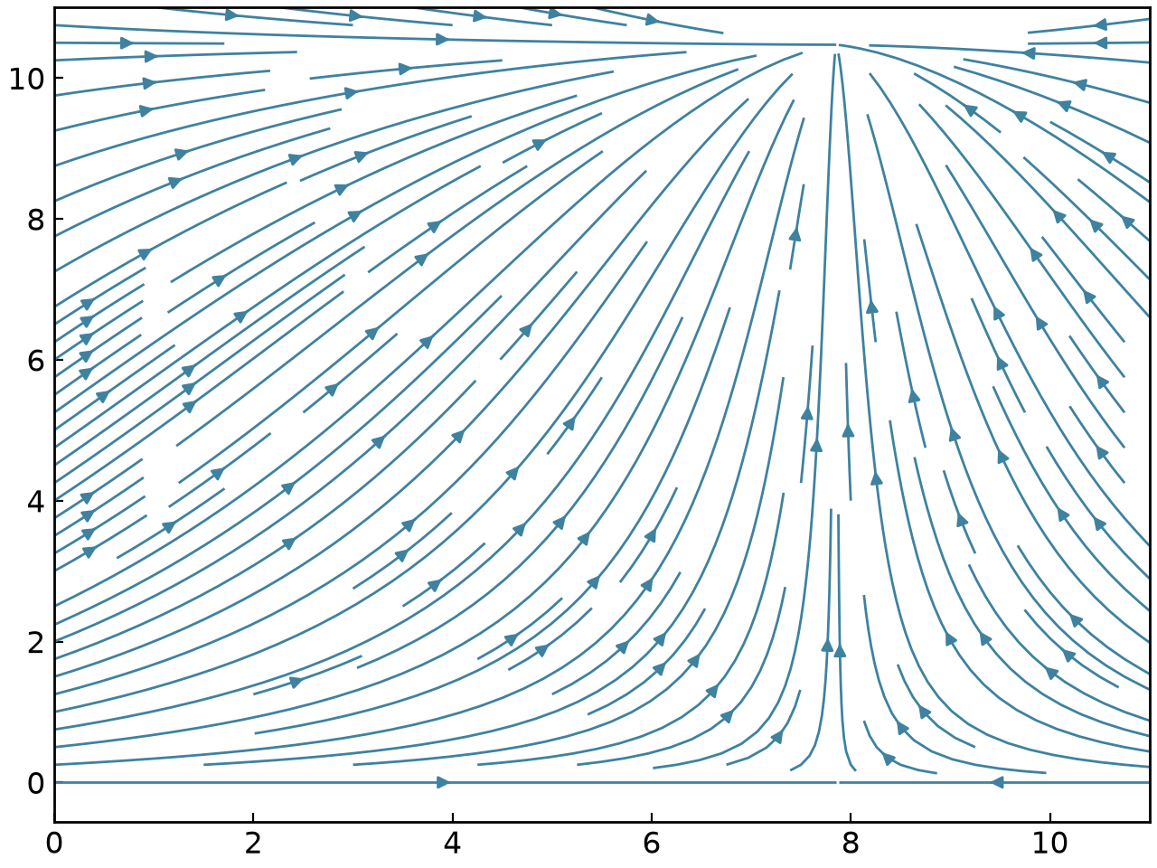
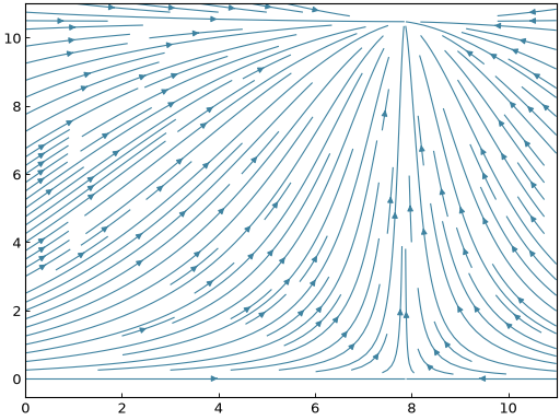
The density parameter used in the example above is the density of stream lines to display. The default density is set to 1, which means that the plotting domain is divided into a 30x30 grid in which each square can only be traversed by one stream line. Note that it is also possible to create a Stream from a function using its from_function() method:
stream = gl.Stream.from_function(
    lambda x, y: (np.cos(x * 0.2), np.sin(y * 0.3)), (0, 11), (0, 11), density=1.5
)